DESIGN ELEMENTS AND PAGE FURNITURE

On the front cover of KERRANG! magazine, there are no additional images other than the main image. This ensures that it will capitivate the audience and they will clearly be able to see what the magazine is about, and the main features in it. The type of shot used is a medium shot, which enables the audience to see the facial expressions of the people involved, as well as their actions. Their actions may support the title of the magazine, therefore adding more effect to the front cover as a whole. Due to the magazine being a tattoo issue, the image represents it very well and would also be something that the audience would be able to relate too. I think this is extremely important when making a magazine front cover as you want to include something that your target audience will be fasinated by, therefore pick up and continue reading. The title of the magazine is also in the design as if it was a tattoo itself, this is a very unique way of presenting the main pieces of text over to the target audience but it is something that will stand out in comparison to the rest, therefore fulfulling its purpose. Overall, the positioning of the different aspects that make up the front cover make it look very professional, structured and attractive.
On the front cover of Q magazine, there are no additional images other than the main image, similarly to KERRANG! This ensures that it will capitivate the audience and they will clearly be able to see what the magazine is about, and the main features in it. The type of shot used is a medium shot, which enables the audience to see the facial expressions of the people involved, as well as their actions. I think this is extremely important when making a magazine front cover as you want to include something that your target audience will be fasinated by, therefore pick up and continue reading, so including images of popular bands or artists will help this. There is a red circle text box on the right hand side of the magazine cover, which is a similar size to the main masthead. This suggests that it is equally important and will be very eyecatching to the target audience. The white text stands out really well in comparison to the red background which will also advertise what will be shown within the magazine. The other text on the page also fits in with the colour scheme. Overall, the positioning of the different aspects that make up the front cover make it look very professional, structured and attractive.


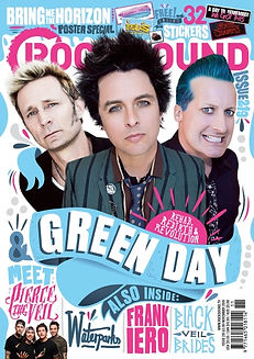
On the front cover of ROCKSOUND there are several images to show what is within the magazine, which is different to both Q and KERRANG! This adds more colour to the magazine which is more likely to capture their attention in comparison to others. Within the strapline at the top of the page there are small images to show some of the stickers that come with the magazine, this is the first thing that the audience would see when looking at magazines, in the shelf, therefore if it is advertising stickers then it stands out in comparison to the rest. The drop shadow behind the title in the banner makes the title appear 3D, hoping to be more bold and eyecatching to the target audience. In addition to this it also makes the magazine cover look very professional as well as fulfil its purpose. At the bottom of the page there are several different bands that are also featured inside. These are topics that the target audience are likely to like and relate to, and each stand out individually due to the different fonts, sizes and colours. Overall, the positioning of the different aspects that make up the front cover make it look very professional, structured and attractive.