
PRELIMINARY TASK
MAGAZINE ANALYSIS OF KERRANG!
FRONT COVER

KERRANG! is produced by Bauer Media Group and is the biggest selling weekly rock music magazine in the UK. KERRANG! magazines have a target audience of people between the ages of 17 and 24, individually cost £2.20 and are published weekly. The circulation of KERRANG! is 43,033, this represents the number of copies distributed for each issue.
The magazine was called KERRANG! as it represented the sound a power chord makes when played on an electric guitar. This links with the theme and the contents of the magazine straight away, making it a great masthead to capture the attention of the target audience. The white masthead stands out in comparison to the rest of the magazine, and due to it all being in capital letters, comes across as very powerful and bold. in addition of this, it also has the effect as if it had been smashed, this reinforces the idea that the magazine is based on the rock genre of music. Behind the masthead there is also a small drop shadow used, this helps it to stand out more and capture the attention of the target audience. Even though the main image used on the front cover is in front of the masthead, immediately when looking at the magazine, your attention is drawn here, therefore fulfilling its purpose. Overall, I think the masthead is very engaging to its target audience as the style is very interesting and keeps readers attention.
This is the strapline that is used on the front cover of KERRANG! and helps to sell the magazine. It stand out in comparison to the rest of the cover as the bright background colour is a complete contrast to the main background.
background. This captures the attention of the reader straight away and due to all being in capital letters, symbolises something important within the magazine.This banner is situated at the top of the magazine which is a great selling feature for new and existing readers within the target audience. It is the first thing that they will see when they are looking on the shelf, therefore it it is bright, eye-catching and bold, it is more likely to stand out in comparison to all the other magazines.

The main image that is used on the cover of the KERRANG! is a good representation of the genre of music shown within the magazine. Due to the magazine being a tattoo issue, the image of on man giving another man a tattoo relates extremely well and would indicate to the reader what the magazine would feature even without the title. Both men in the image are looking at the camera, which draws the readers attention in straight away to that area on the page. They're facial expressions are also a great representation of the topic, which could also be relatable to the target audience. The man on the left of the image has a facial expression which indicates much more excitement and enthusiasm than the man on the left, which also supports their actions also. As the issue of magazine is to do with tattoos, the image portrays this to the target audience very well and engages the reader, making them want to continue and read more. The
The clothes that are worn in the front cover are also relate to the rock music genre, and are likely to appeal to the target audience. They are not brightly coloured, nor are they dressed smartly, which continues the theme even more.
The title of the magazine is presented in a very unique way, as it has been made to look as if it is a tattoo design itself. This makes the magazine very eye catching to the target audience as it is something that you do not usually see, therefore causes curiosity which entices the reader in. The title is also in the centre of the page and due to it being so large so bold, immediately lets the audience know that the magazine is about. It also anchors the main picture and makes the overall appearance of the front cover very structured and professional. The colours within the title are very bold and prominent, which adds a great effect to the style of the cover. Red appears to be the house style of the magazine as it is the colour used most of all, being incorporated within the title as well as the background.

These were additional pieces of text on the front cover advertising what was shown inside the magazine. The background of the strapline was contrasting the main background, therefore was very eye catching and bold.

bold. The colours that were used in each of the straplines were reversed, which continued the theme of the colours, as it was also used in the strapline at the top of the page also. The information that is given on the front cover does not go into depth about the different topics within the magazine, yet makes the audience intrigued and want to read more.
CONTENTS PAGE
Inside this issue of KERRANG! magazine there were 64 pages, 13 of which were used for advertising. Companies use KERRANG! to advertise their offers, products and services which they think might appeal to the same target audience. There are many different types of advertisements within the magazine, the main type being the promotion of different concerts. This is expected when looking in music magazines due to it being there perfect audience to address. If the concerts are advertising bands that fit into the same genre of music that the magazine is, then it will most likely appeal to many members of the audience. It is also a great way to address such a large number of people at the same time that have an interest for the same thing. Other types of articles also included video games, different clothing companies, charities, and phone contracts.
One the first page as you open any magazine there is normally a contents page which enables the reader to see exactly what is wrote about within the magazine. This will relate to the genre of music that the magazine is about, as well as relate to what is being shown on the front cover. The same house style will be continued throughout the magazine and this will make the overall appearance look structured and professional. It is likely that the same colour scheme will be continued so they can easily relate to one another.
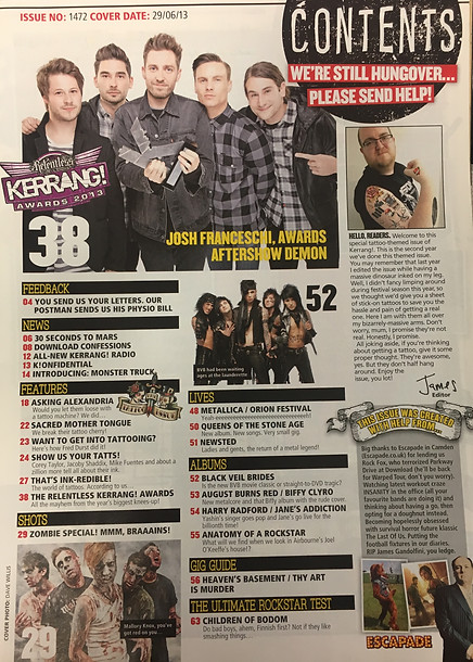
Within the different sections of the contents page, the different pages are separated by titles. The same colour scheme that was used for straplines on the front cover is also used here, therefore keeps the design consistent and relates them to one another. The yellow text is extremely eye catching against the black background and uses a font which is clear and easy to read yet also has an effect to it that makes it suit the genre of magazine also.
In addition to this, the page numbers are in red. This could be so that it is clear to see in comparison to the main text, to prevent readers becoming confused, as well as wanting it to be easy to find the information within the magazine that you are looking for.
Each of the page titles, relate to the topic of the magazine, therefore keep the house style very consis

consistent throughout. They are all in bold so it is clear and easy for the reader to identify the different pages, as well as their corresponding page number. Due to each of the different titles sounding interesting they make the magazine very inviting to the target audience. Underneath each of the different page titles, some key details of the page are listed to try and attract the target audience to read the page. Furthermore, the image that is included on the contents page is also the main title of the cover, this will relate the pages to to one another which will draw in the attention of the target audience even more.
DOUBLE PAGE SPREAD
In this issue of KERRANG! there were also 18 double page spreads, the majority of them were about the different tattoos that many different band members have, as well as what they each mean. This fits in with the overall theme of the magazine and is what would appeal to the target audience. In addition to this there were also double page spreads informing the reader facts about different bands. This is also advertised to the audience in the strap lines on the front cover, therefore will be one of the selling features of the magazine. There were also 7 advertorials, which means it was difficult to tell whether the page was an article or if it was an advert.


On the double page spread the main focus is the image and the title. Straight away you can see what the topic of the page is, which also relates to the front cover and the contents page. The same people that were shown on the front cover of the magazine are also shown on several of the double page spreads, as it is known that the reader is interested in this topic, as it is what drew them to it originally.
Due to there being so much text on one double page, some text is made bold so that it stands out in comparison to the rest. This text is generally the key points that are made and the introduction to what is being said on the rest of the page. The red background stands out in comparison to the rest of the page and is the first piece of text that the reader is drawn to read. The white text is also very prominent on the red background and is different the the main body of text on the double page spread which is black. This supports the meaning of the different coloured text box and emphasises the importance of the text.
Throughout the double page spread there are several drop caps which are there to draw the attention of the reader to that part of the page. They are bold and large making them very eye-catching to the audience, and are usually the first letter of the sentence.
